My photography exhibition was reviewed by a lovely Belgian. Dank u wel, Marie France Asselbergh.
The exhibition opened @Choice New Zealand, Vlaamsekaai 10, Antwerp on Fri, 31st of October, 2014 and will hang there for the month of November. All are welcome.
While I love art and paintings especially, I am hardly knowledgeable about them. Photography? I’d be hard pushed to name one renown artist… Black Man Ray? I hope I’m not mixing that up with Ray Ban, which I’m fairly confident is sunglasses.
I cannot claim to know Di Mackey either. We met once, had a lovely talk and keep acquainted on Facebook since. But then I only follow people who keep my interest piqued; what would be the point otherwise?
So when I received an invitation for the exhibition I was raring to go (nothing to do with why I showed up three hours early though), very intrigued and hoping to catch a glimpse of the woman through her work. And did I? Read on. Online I’d put a smiley here!
Arriving at the cozy and congenial café cum gallery, I worked my way through the busy throng and briefly greeted an elated Di before turning my attention to her work. Elated, by the way, with the general show-up and not just me, hehe.
At this point, I must confess I was dreading as well as looking forward to seeing pictures of New Zealand, Di’s home turf and the place on earth that so got under my skin. I was spared in the sense that there were only two, at first sight rather generic landscapes. But judging by the next two paragraphs, they had rather more to tell.
One of a Coromandel beach, a place I visited but only inland. It is a more generic but truthful view of the rural seaside there: sheer desolation that I doubt can be fathomed by the average Belgian often only familiar with overcrowded European beaches marred by skyscrapers. Here, the inevitable fishing boat is a realistic reference to the innumerable ones bobbing along the endless NZ coast line, symbol of fine weather, leisure and companionship. This carries through in the pair on the sands, a dad sharing some quality time with his son, carrying on the tradition too.
The second one, a view of a gate and barn on South Island. I am immediately drawn to the lush, moist greenery I so associate with NZ. The focus is on the wooden, lichen covered gate up front, rather than the barn further away, thus swallowed up in the surrounding landscape. It reminds me of the sheep farms, the corrugated iron roofs so endemic to the landscape. The kind of picture I would gladly gaze upon during a whole month, if it was on my calendar.
I must perhaps add the Taniwha picture to this list. The rich Maori mythology is not as ungraspable as the Aboriginal one, I find. This oily, elusive reflection I can relate to the Norse beliefs. Likewise, animals or wood can be inhabited by spirits there. Yet I would never mistake this for a Scandinavian image, due to the torsion, the curliness found in Maori imagery. I wonder, what it takes to actually detect such a photo opportunity and in which circumstances this occurred. An extremely imaginative and hyperaware eye, I suppose.
I see a second group, photos taken in Antwerp. The Carina at the old port’s quayside. The sequence of secondary ships gives depth to this view, the red paint a hint of warmth rather than cold in this industrial landscape.
Judging by the boy’s cap the photo of the huge mural with the two bikes fits the bill, but I do not recognize the location. It must be difficult to keep a sense of perspective and proportion when tackling such a view, but the photographer seemingly remained unfazed and achieved it effortlessly.
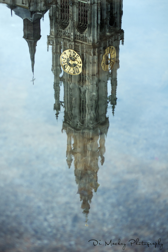
An instant favourite: the upside down reflection of the Antwerp Cathedral, symbol of what makes a Sinjoor’s* heart beat. For the first but not the last time, I find myself doubting that this is a photo; the image looks like a painting, Gaudi-esque in composition with hints of the palette and watery reflections of Canaletto. It is iconic, transcendent in its appeal.
I have similar associations with the Bernini Angel. Including the original framing and its colours, it instantly calls the works of Magritte to mind. To continue the theme, I’ll say this is the first of the Italian group.
Which brings me to the anchovies. I require further proof, if I am to believe this is a picture and not a painting. Perhaps I should further elaborate, that this a favourable comment in the extreme.
The portraits are very deserving too. The thought comes to mind, Di might be ill at ease herself to take pictures of unwilling subjects or people who simply do not feel comfortable enough in front of a lens.
Atypically, the girls in one of the portraits seem devoid of teenage angst and the image of wholesomeness. Who would not want his or her loved ones portrayed like this to be displayed and enjoyed at home?
Beautifully done, the owl and the loom. I like and much prefer colour photography. Black and white is often considered superior, arty and thus somehow more deserving. I like it in some high quality portraits but not per sé. A landscape is seldom served well by a monochrome approach, in my opinion. This series of images subscribe to my point of view, I find.
As a whole, Di Mackey’s work exudes warmth. In the colours, the people portrayed and more unusual even in the presence of water. More often it will add coolness or even a chill, but not here.
I also sense acuity. A photographer must have technique but an artist adds his or her own intrinsic qualities. An eye for composition, a uniqueness, drive. Boxes ticked, for this laywoman.
*Sinjoor: a ‘true Antverpian’, if you are not already familiar with the term.
The cathedral shot mentioned above.